Monitor
Find the latest position for a particular LC, liability account and collateral group.
Trade · Citi · Insurance Letter of Credit
IL for Reinsurers helps treasury and inputter users search a Letter of Credit, understand balances and transaction history, and reconcile surplus or shortfall amounts without depending on fragmented reports and difficult navigation.
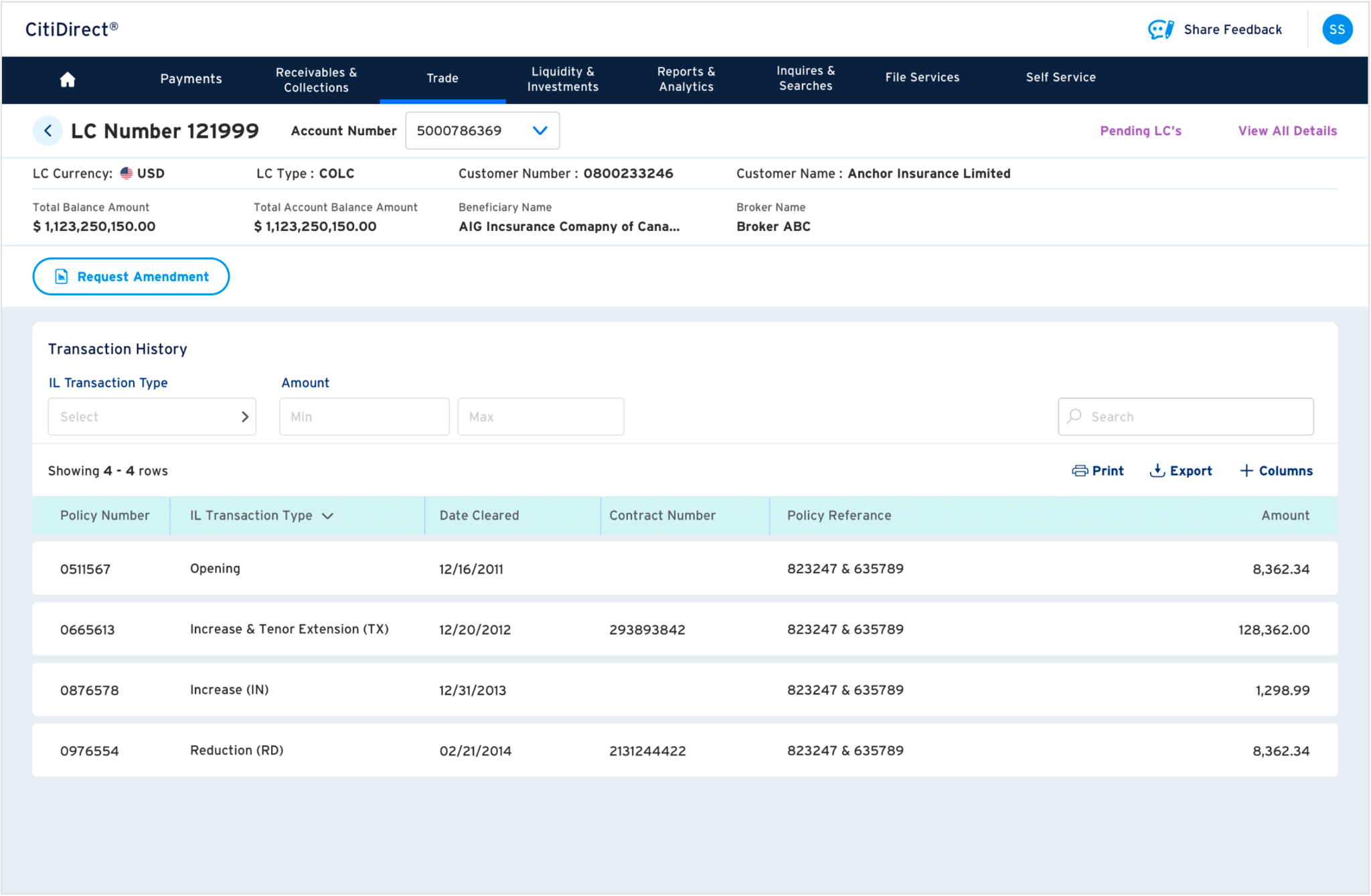
Users were heavily dependent on weekly or monthly Collateral Valuation and Account Statement reports. The product had useful LC information, but awareness, navigation, data visibility and drill-down made routine reconciliation harder than it needed to be.
Find the latest position for a particular LC, liability account and collateral group.
Understand surplus or shortfall and determine whether funding action is needed.
Reduce dependence on report snapshots, internal records and support follow-ups.
We interviewed Renaissance Re, Sirius Point and QBE: six participants across Treasurer and Inputter roles, with roughly three hours of interviews. The study validated journeys, search and drill-down behaviour, monitoring workflows, current usage and pain points.
participants across three clients
captured data points across workflows, needs and pain points
priority user journeys identified
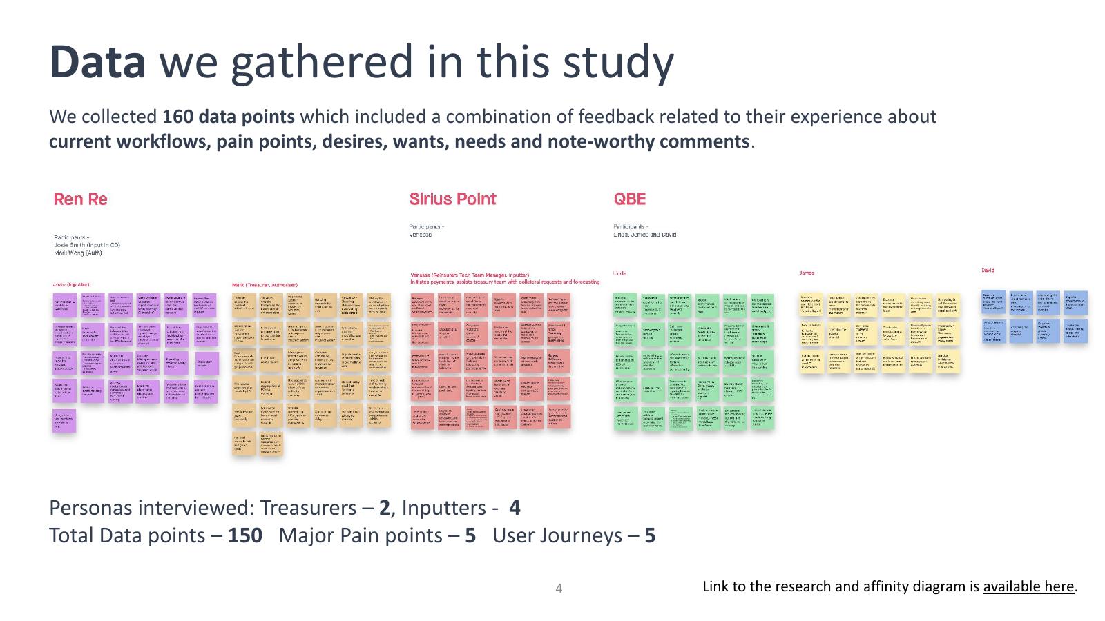
Research synthesis: observations grouped across the three client interviews.
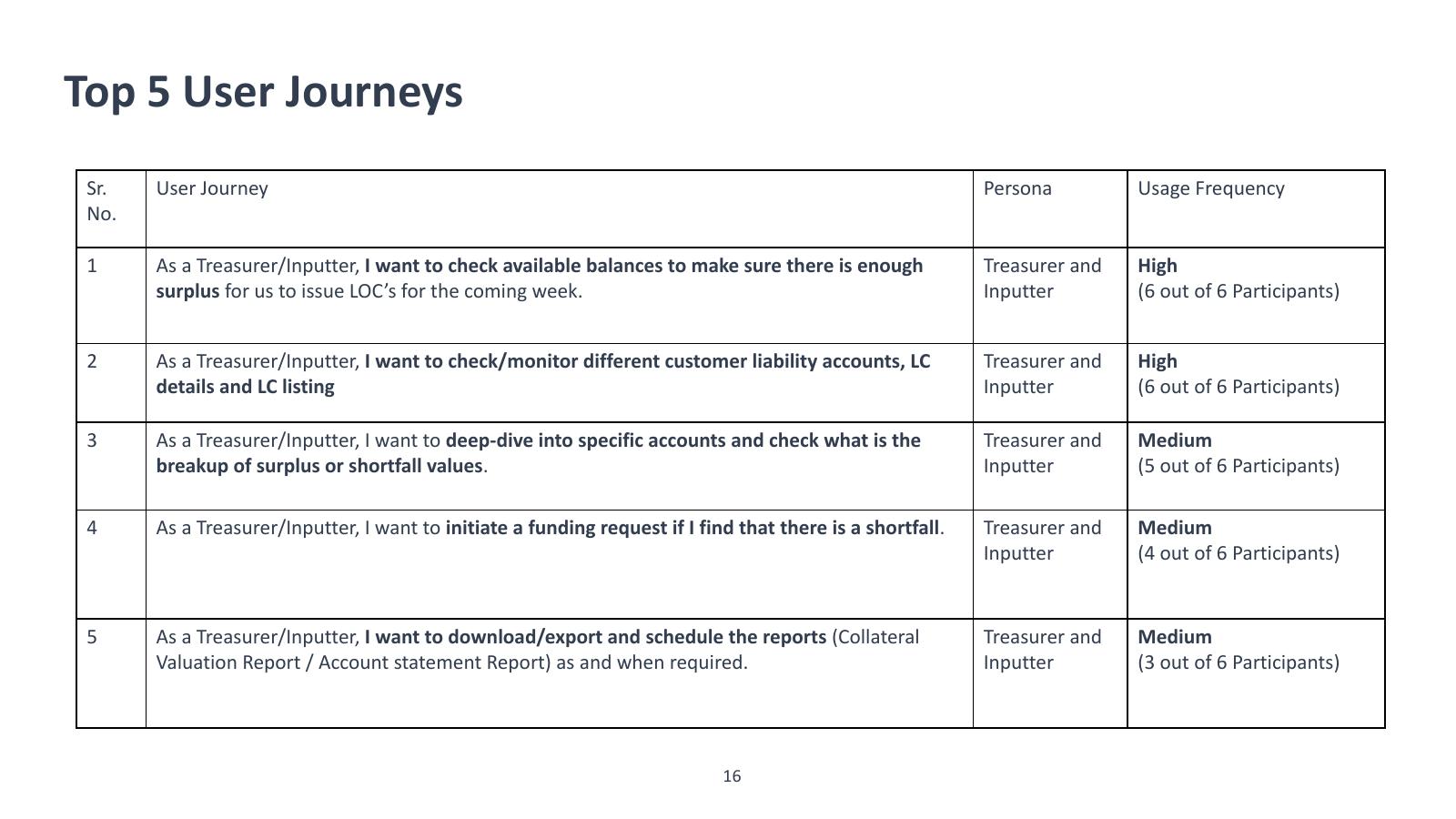
The research converged on five high-value monitoring and reconciliation journeys.
Instead of showing the full research deck, this portfolio view focuses on the findings that directly influenced the experience.
Participants prioritised searching a particular LC and getting its latest balances and collateral details.
Users needed to understand surplus/shortfall and initiate funding when required.
Four participants said they were not aware of functionality already available in IL for Reinsurers.
Report snapshots led users to maintain internal records, hold transactions and contact support while waiting for confirmation.
Complex navigation, missing information and hidden drill-down behaviour made users feel training was required.
“Too many popup’s, too many steps. It’s overwhelming, sometimes less is more.”
— Research participant
Make customer, account and LC number entry visible at the top so users can reach the right context quickly.
Bring collateral group, liability and surplus/shortfall information forward instead of making users hunt through reports.
Move from group → account → LC → transaction detail while retaining context and providing filters, export and actions.
Prioritise the questions users repeatedly asked support: Where is the LC? What changed? What is the balance? Is there a surplus or shortfall? What do I need to do next?
The proposed and detailed screens connect dashboard search, collateral group summary, account details, LC details and pending transactions into a more coherent information hierarchy.
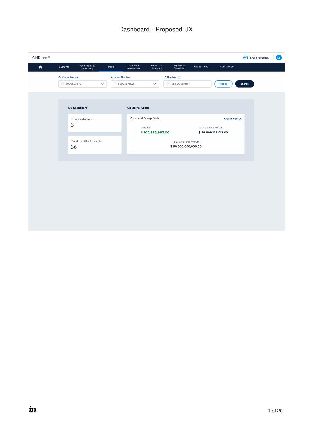
Dashboard: search plus collateral summary.
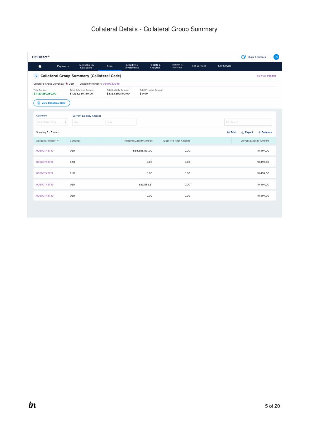
Collateral group view: balances and account-level detail.
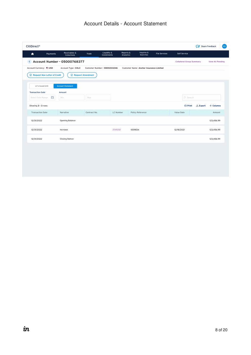
LC details: key information and transaction history in one context.
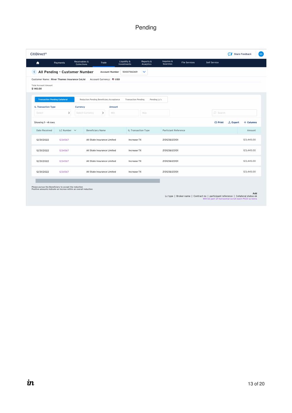
Pending work: clearer status-driven views for follow-up.
The study converted scattered feedback into prioritised journeys and UX recommendations: real-time collateral/account summaries, optimized search, clearer drill-down, funding actions, customizable balance views and downloadable/scheduled reports. The source material documents concept evolution with stakeholder and technology teams followed by client validation as the planned next step.
High-frequency journeys centred on checking balances, monitoring customer liability accounts and reviewing LC details/listings.
The redesign organised information around customer, account, LC and transaction context rather than disconnected navigation.
No unsupported business KPI is claimed here. The case study shows documented research findings, recommendations and the resulting design direction.